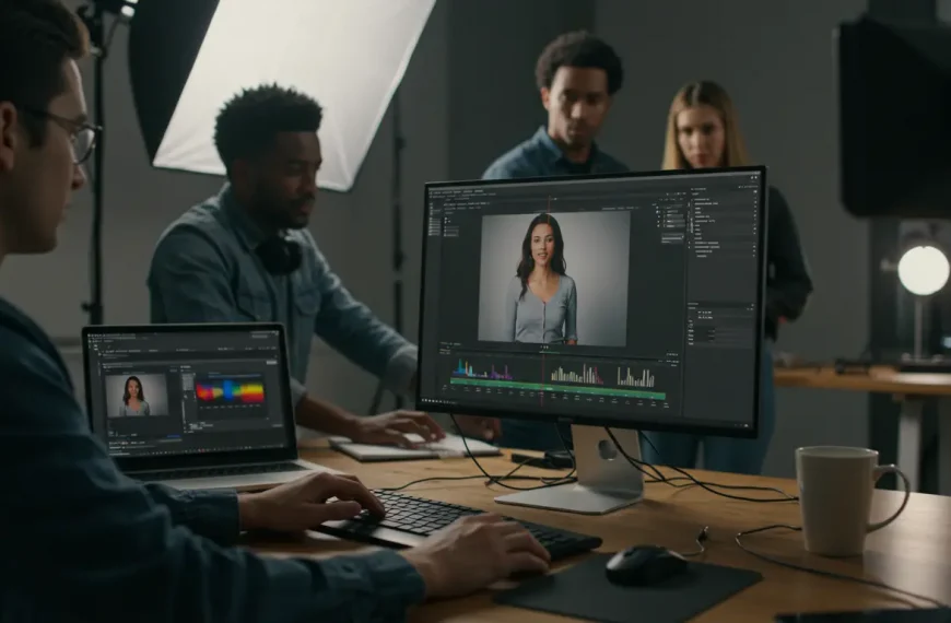
Color and Visual Appearance
Why do Netflix, HBO, and Prime Video films feel “cinematic” while your videos, even well-shot ones, look “flat” or “digital”? The answer lies in one word: COLOR.
Color grading isn’t “slap on a LUT and call it done”. It’s understanding color psychology: blues for melancholy and nostalgia, warm oranges for romance and intimacy, desaturated greens for tension or drama, pastel tones for lightness and joy. It’s knowing when to use “natural” versus “stylized” color. It’s creating a visual identity your audience instantly recognizes as “your style”.
In this section you’ll find everything needed to master the visual aspect of your projects:
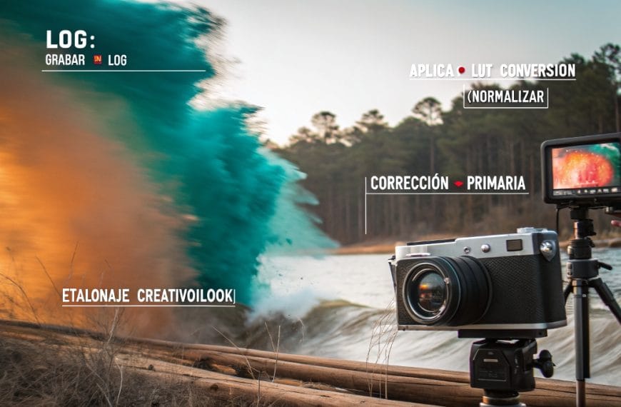
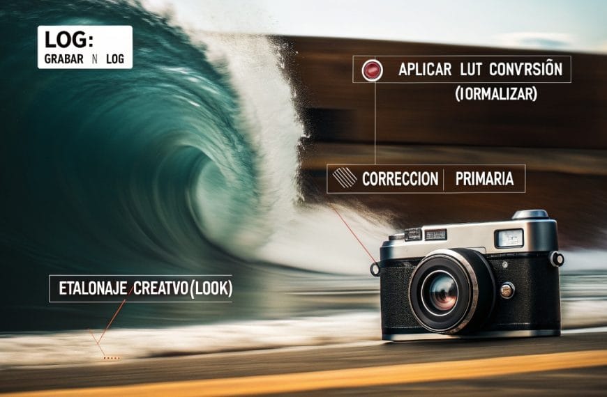
→ LUTs explained without jargon: what they are, how to use them correctly (and when NOT to)
→ Color grading from scratch: curves, color wheels, HSL, white balance mastered
→ Color correction vs. color grading: the difference many editors don’t understand
→ Perfect skin tones: flesh tones that look human, natural, not plastic or artificial
→ Color matching between different cameras: Canon + Sony, iPhone + DSLR, GoPro + main camera
→ Color rescue in poorly-exposed footage: when you shot too dark, too bright, or with wrong white balance
→ Popular cinematic looks: teal and orange, bleach bypass, vintage film, moody dark, airy bright
→ Color grading for different genres: romantic weddings, vibrant quinceañeras, professional corporate, urban/modern content
The right color can make your wedding video go from “pretty” to “I cried watching it”. It can make a corporate event feel premium instead of generic. It can make your social media content STAND OUT among thousands of flat Instagram-filtered videos.
Because color doesn’t just affect how your video LOOKS. It affects how it FEELS.
From “well-shot” to “visually unforgettable”: that’s the transformation professional color grading achieves.
 By
By